Case Studies·01·Consumer health
Let's Kill Ed is a mobile app for families in eating disorder recovery. Every food and meal tracker on the market is built to help people eat less. Recovery asks the opposite. I led the research, set the creative direction, led UX, branding, and UI, and shaped the product around how treatment actually works, then built it with Asa Gilmore.

01 · Background
Eating disorders are psychiatric illnesses with serious medical consequences, and they often begin in adolescence. For adolescents, research shows that family-based treatment, delivered at home with parents at the center, is among the most effective approaches. Let's Kill Ed is built on two established clinical frameworks rather than inventing its own.
Also called the Maudsley approach. Parents temporarily take charge of their child's meals and nutrition, then hand control back in phases as recovery progresses. It's a leading evidence-based outpatient treatment for adolescents. FBT defines who does what, and when.
A visual method from dietitians Wendy Sterling and Casey Crosbie. Families plate full, balanced meals that include every food group, without measuring or weighing at the table. Plate-by-Plate defines what goes on the plate.
02 · The problem
In family-based treatment, parents take responsibility for every meal while their child recovers, and the care team needs to know whether the child is getting enough. In practice, that meant spreadsheets, sticky notes, and diet apps. The diet apps were the worst option: their whole model is a deficit, with red warnings when you go over.
The product serves people with different needs. The parent does the logging, usually exhausted and mid-meal. The child is the patient. Dietitians, therapists, and doctors need a clear picture between appointments.
03 · Research
We started as the users. Then we tested what we'd learned against other families and the clinicians who treat them, so the product wasn't built for one household's habits.
We supported a loved one through FBT ourselves, logging every meal and weigh-in by hand for two long years. We documented where the work broke down: at the table, at handoffs between caregivers, and before appointments.
LearnedLogging took time away from the meal itself, and the parent needed that time to be present.
Dozens of interviews with parents and caregivers in FBT, covering their daily routines, the tools they had tried, and what they dreaded about mealtimes.
LearnedFamilies were patching together spreadsheets, notes, and diet apps. The diet apps actively worked against treatment.
Working sessions with a registered dietitian on calorie ranges, Plate-by-Plate, and recovery-safe language, plus ongoing review as the product evolves.
LearnedThe target is a range set by the care team. Clinicians want the trend between visits, not every bite.
Conversations with therapists, doctors, and the nutrition team about what they need from families between appointments and what they never want a family or patient to see.
LearnedSharing had to be view-only and revocable, and the family had to stay in control of the data.
An Android beta with four families using the app at real meals, with feedback gathered through check-ins, interviews, and surveys.
LearnedPending. Still in beta.
04 · Creative direction
Recovery tools tend to sound like a clinic or a diet app. I wanted neither. The creative bet was the name itself: Let's Kill Ed. It turns a diagnosis into a shared enemy and gives an exhausted family a rallying cry. Ed is the illness, never the child. Once that's clear, the family stops fighting each other and starts fighting it together.
That one idea set the rules for everything that followed: the mark, the voice, the color, and how the app behaves at the table. Every decision answers to the same tension, and the vision for the product sits in the middle of it.
Every screen should make this meal less challenging.
The rules that came out of it
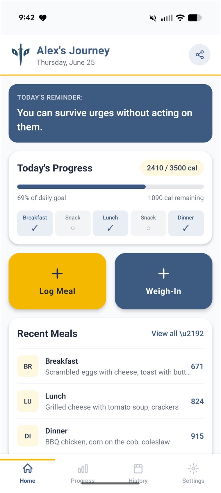
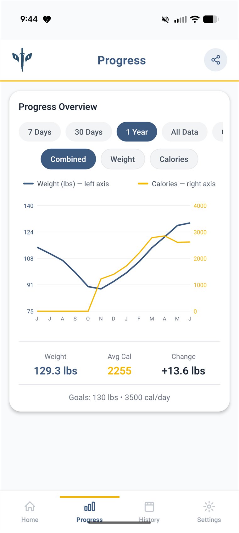
Calorie targets work as a minimum to reach, not a ceiling. Weight is charted as restoration. Nothing in the product rewards eating less.
Naming the disorder "Ed" lets the family face it together, without blame or shame. The voice of the product sits on the family's side.
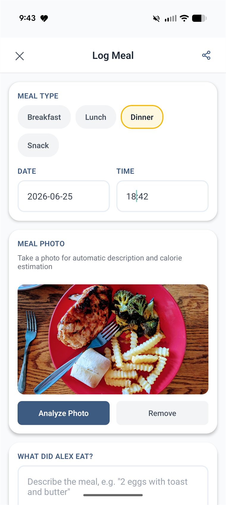
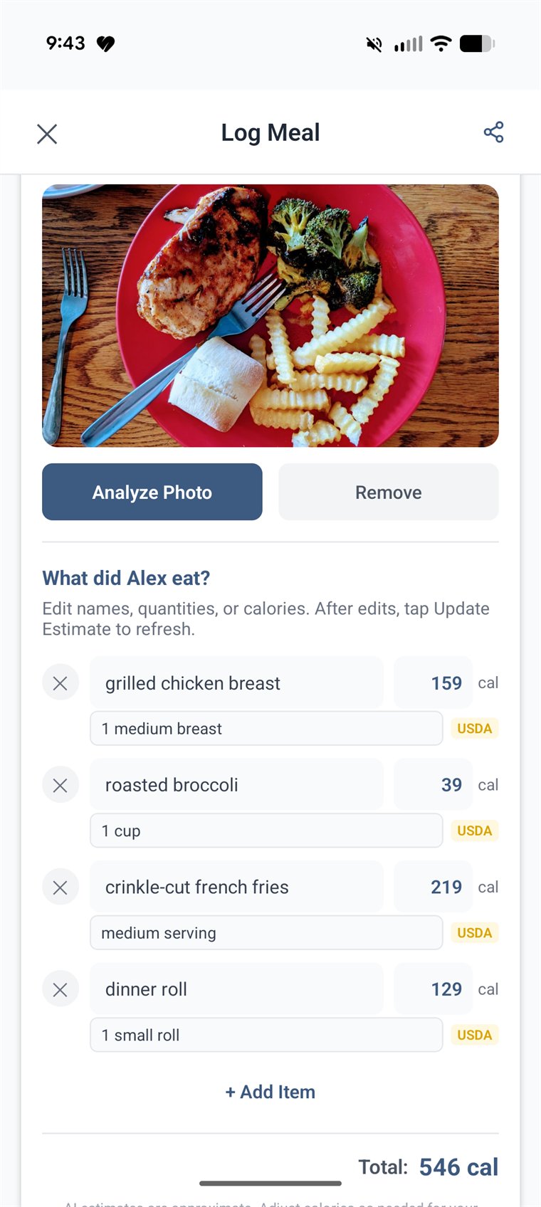
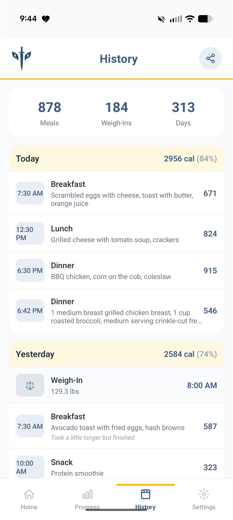
Exhausted, one hand free, mid-meal. A photo replaces typing, primary actions are large and few, and nothing needs a tutorial.
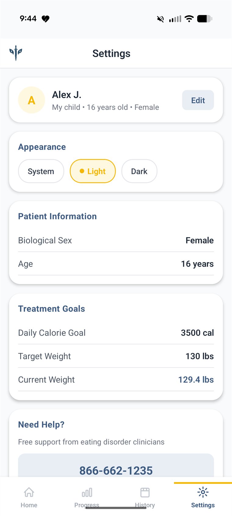
Recovery data belongs to the family. It lives in their own Google Drive, and they choose who sees it.
05 · Visual craft
Clinical tools feel cold, and wellness apps feel like they're selling something. I aimed between them. A calm slate blue carries the interface, and a warm gold marks hope and action. Nunito's rounded forms soften every number on the screen. Generous radii, soft surfaces, and large type are there for tired eyes and small screens.
The mark carries the story. The eyes come from the name our family gave the illness. The sword is the tool to fight it with, and the shape opens into a butterfly, a symbol of recovery.


Screens show demo data for a fictional user.
06 · Product thinking
Family-based treatment moves in phases, and what a family needs changes with each one. The beta focuses on the heaviest phase, when parents carry every meal. The roadmap follows the arc from there, so guidance stays relevant and responsibility can shift back to the young person when the care team says it's time.
Fast logging, progress toward the care team's target, and a clear record to share between appointments.
Working with a dietitian partner on plating exercises and structured guidance for each phase of support.
Support for handing choices back, tied to progress the family and clinicians agree on, not to a calendar. The app recedes as the family needs it less.
07 · From system to build
A small team can't afford drift between design and code. I defined the system first in Claude Design, as named colors, type styles, and components, then used Claude for AI-assisted design-to-code so new screens came out on-system by default. That freed our time for the decisions that mattered: tone, edge cases, and the moments when a family is struggling.
The same approach scales up. Clear components and written principles are what let AI tools, and new designers, produce work that meets the bar without a principal reviewing every pixel.
08 · Where it stands
09 · What carries forward
Building in health care means building consciously. Every product decision affects someone's health, privacy, and trust. These are the lessons I'd bring to any patient experience.